THOR: LOVE AND THUNDER TITLE DESIGN
Thor: Love and Thunder required a main-on-end title sequence built around the film's 80s hair metal aesthetic - loud, colorful, and deliberately over the top. The concept centered on treating every credited name as its own rock band logo, with each card custom designed and personalized to the individual. Over 250 typeface explorations were developed across the project before the final direction locked in.
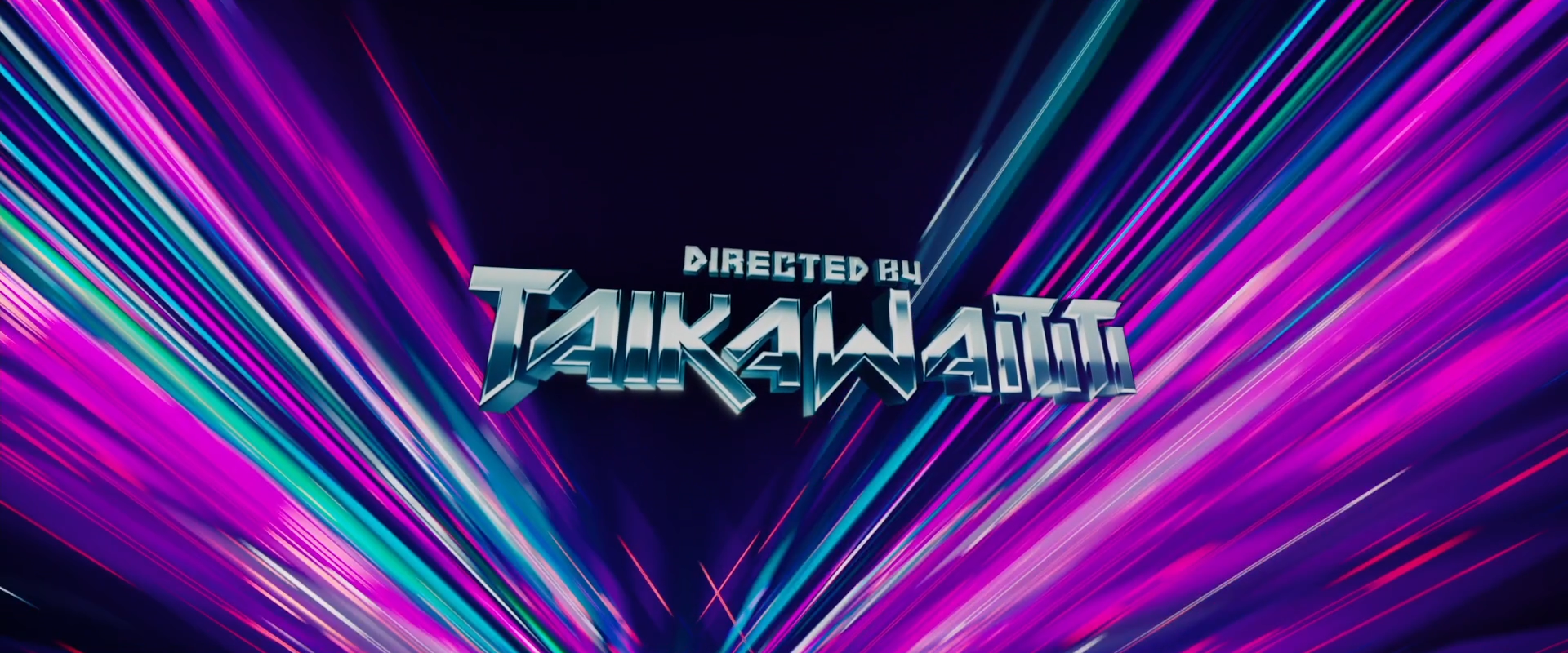
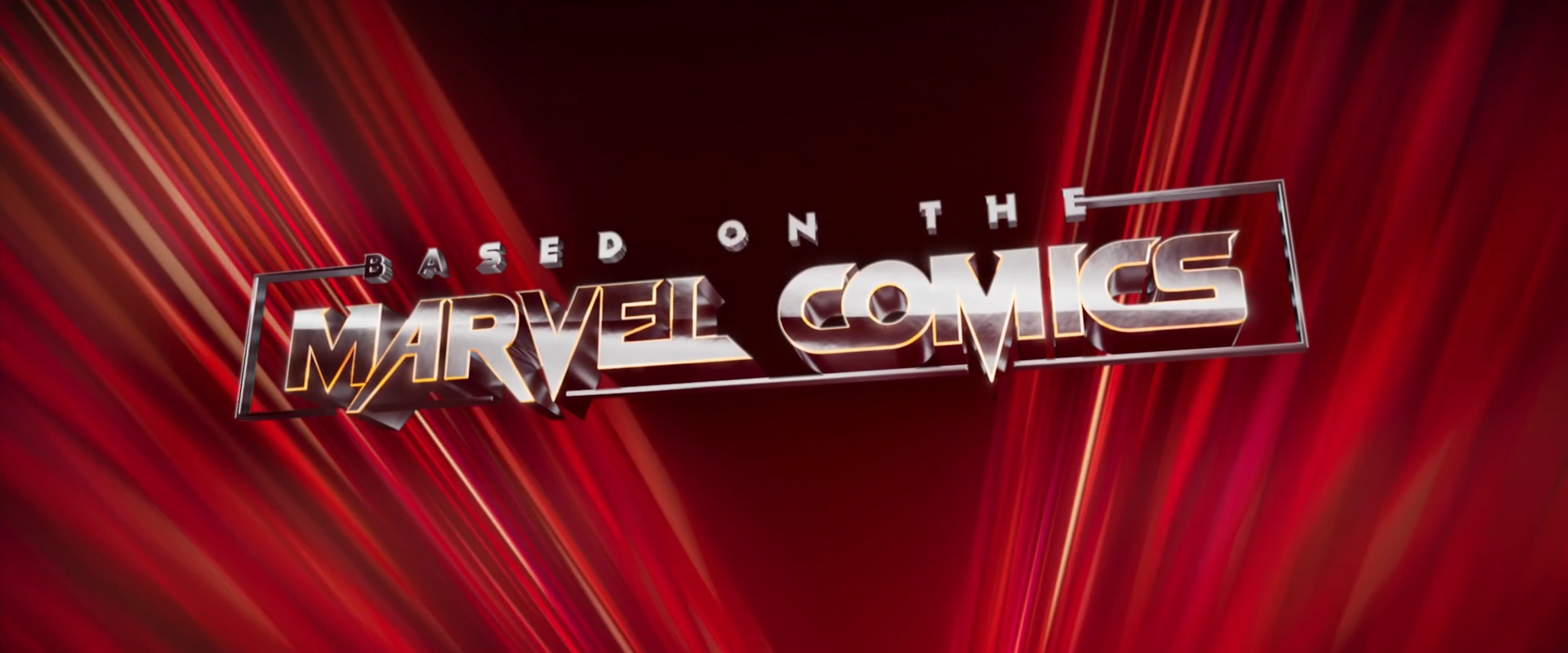
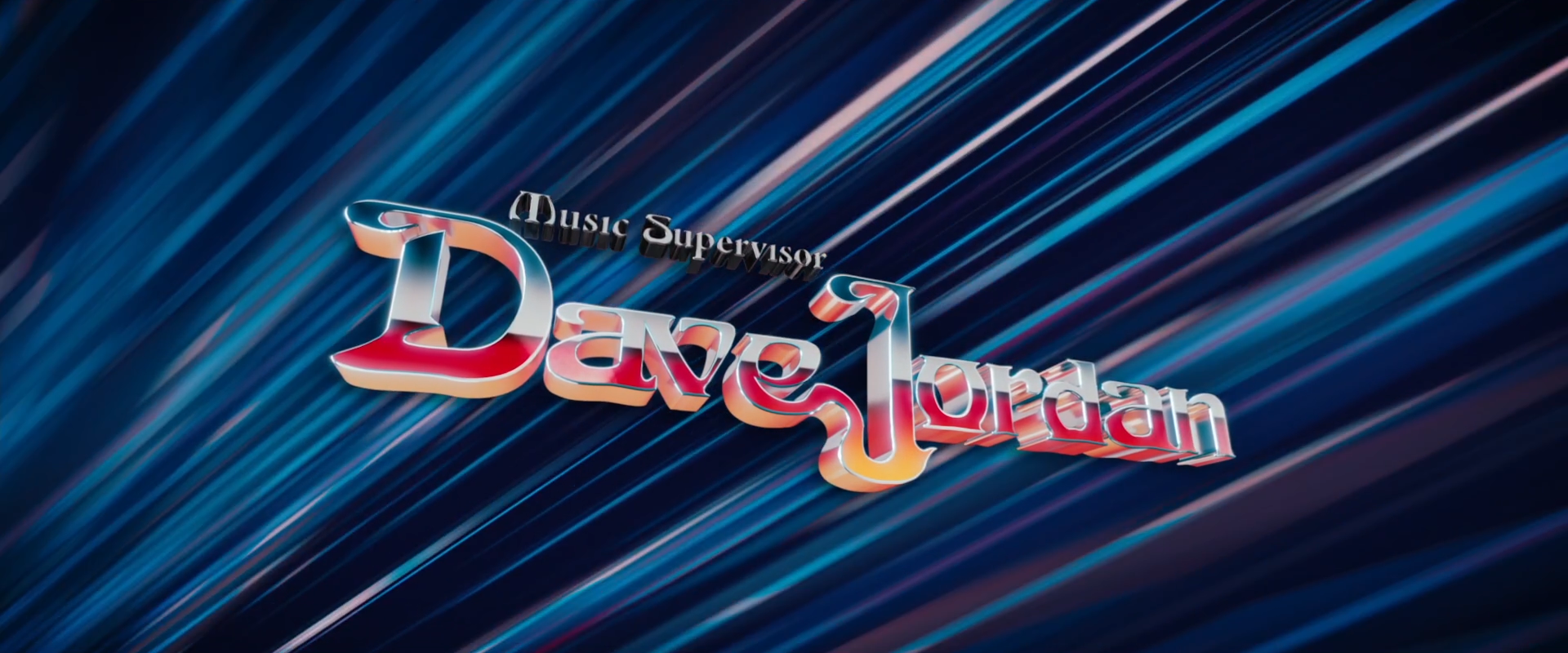
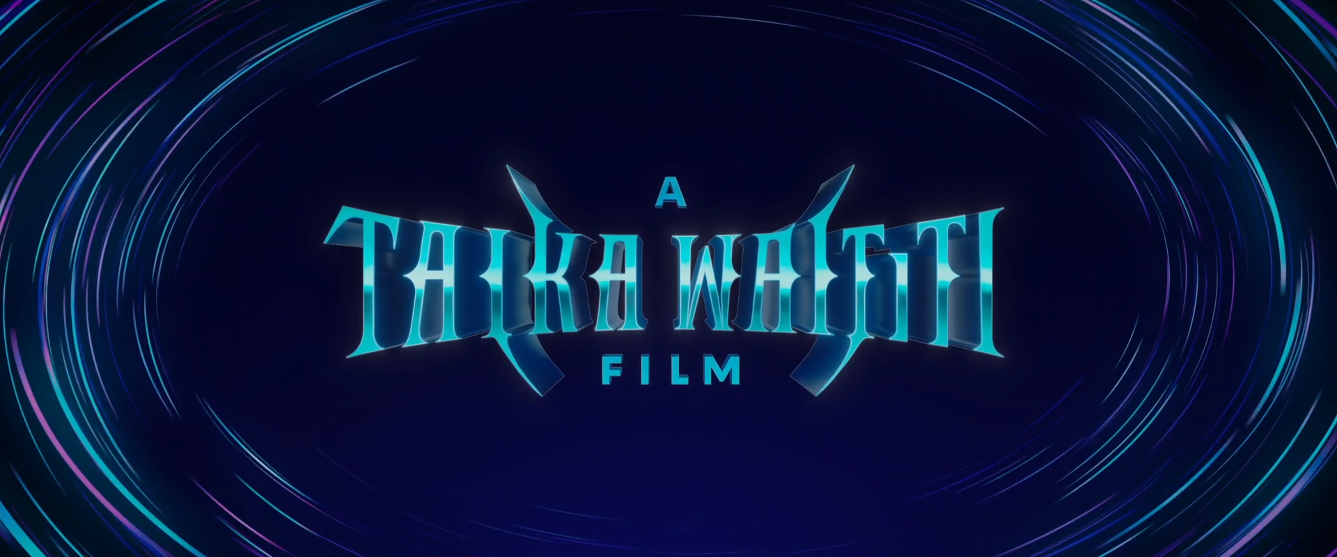
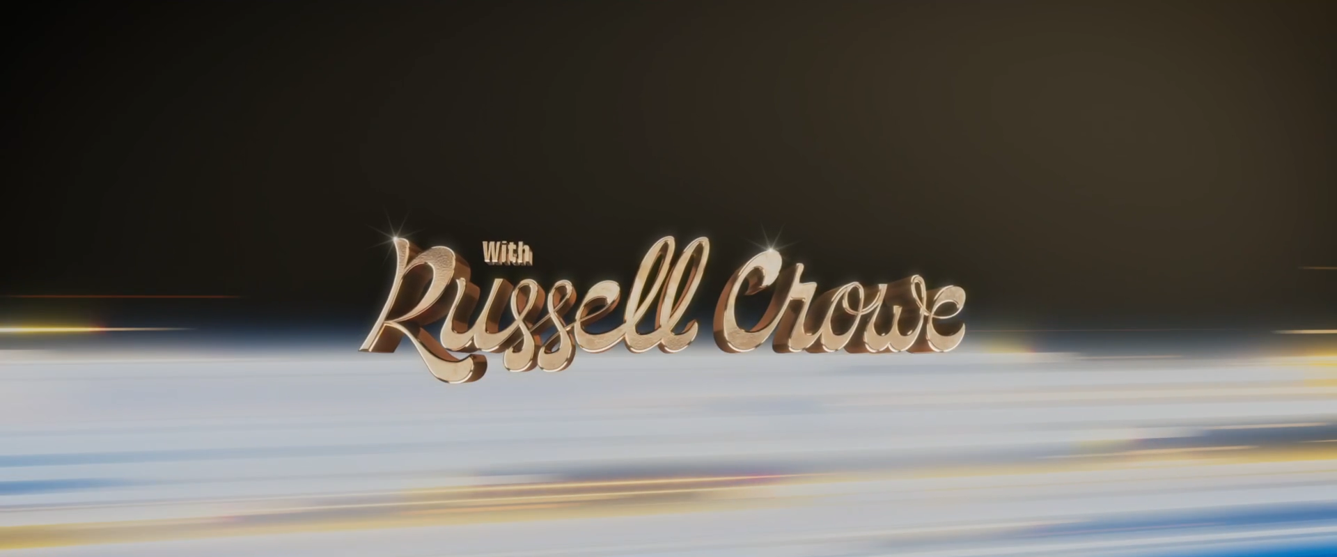
Thor: Love and Thunder required a main-on-end title sequence built around the film's 80s hair metal aesthetic — loud, colorful, and deliberately over the top. The concept centered on treating every credited name as its own rock band logo, with each card custom designed and personalized to the individual. Over 250 typeface explorations were developed across the project before the final direction locked in.
I worked as a designer and animator on the sequence at Perception, contributing across the logo development and animation pipeline. Each logo was hand drawn, vectorized in Illustrator, then brought into Cinema 4D where depth and dimension were added before rendering in Redshift and compositing in After Effects. The backgrounds - inspired by Bifrost and 80s concert laser shows - were built with cloners and animated shapes pushing toward camera, creating the sense of constant forward momentum behind each card.
ALL IMAGES ON THIS PAGE ARE THE PROPERTY OF MARVEL STUDIOS.
Role: Designer, Animator
Studio: Perception
Client: Marvel Studios
Tools: Cinema 4D, After Effects, Redshift
Year: 2022